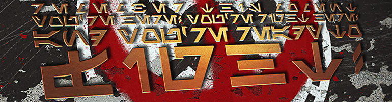
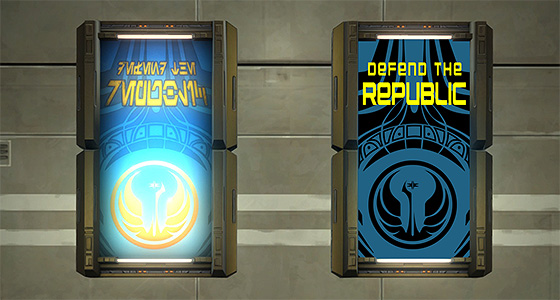
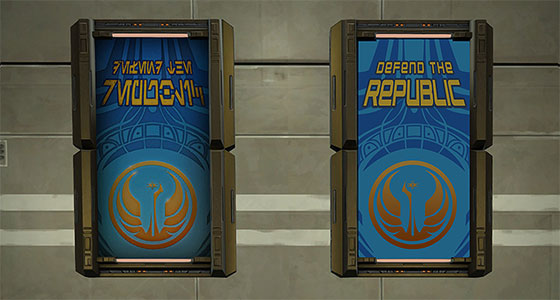
I’m quite certain I would be remiss in my job if I did not translate the four amazing propaganda posters players received as part of Star Wars Celebration’s Community Cantina event. My first selection confirms my longstanding Republic bias, but I will endeavor to do justice to the Imperial posters soon enough!
I thought it also might be interesting to describe the process I go through in these recreations and to point out some of the challenges I face along the way.
Step 1: Get the Perfect Screenshot
Spotting a cool looking poster or sign is the easy part. Finding a clear view, with good lightning is a different cup of tea. I’m sure I’ve spent hours cruising around Nar Shaddaa and Corellia looking for the perfect example of a neon sign or poster to capture. Even then, I may need to climb over nearby terrain or obstacles to get a good angle. I often hop on a tall mount and desperately mash the screenshot button mid-jump to get as high and close a view as I can get.
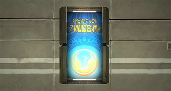
In this case, of course, I am working with a stronghold decoration, and was able to hang the picture frame at an ideal height in a well-lighted room.
Even under the best of circumstances, however, I still adjust the screenshot when I bring it into Photoshop in order to get the image as straight and front-on as possible.
Step 2: Break it Down into Parts
Next I copy the dimensions of the original poster and then roughly duplicate graphical elements, such as lines, shapes and general text that make up the image. I adjust all of these elements as I go, but I find it’s best to put together a rough pass of the full image before getting too bogged down in the details.
Sometimes the layout of the poster will only consist of a few broad shapes or lines, but it’s not uncommon for various symbols to be included in the design. Many of these, such as planet icons or logos for the Coruscant Market or Hypermatter Corporation are repeated, and I have assembled over the years a collection of common graphics that I can drop in when they appear.
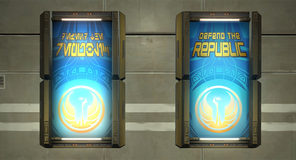
Here the Republic Propaganda poster has a complicated background pattern. I probably could’ve used Photoshop’s selection tool to make a basic copy, but because I think it’s a neat looking design I decided to render a full recreation in Illustrator. This took a lot longer, but I’m pleased with the result.
I swiped the Old Republic logo from Wookieepedia, and I suspect the artist who designed this poster did the same since it easily aligned with the original. Curiously, the logo is reversed in the in-game version of the poster. Whether this was an accidental oversight or confirmation of Bioware’s Sith bias, who can say? I tend to keep spelling mistakes intact in my recreations, but in this case I could not resist placing the Republic logo in its proper orientation.
For English text, I use a free font called Nakadai. It has a similar line weight and size to standard Aurebesh, and I find it allows my recreations to maintain visual consistency with the originals.
Step 3: Color Time!
Once I’ve got the layout set, I drop in colors, apply simple gradients where needed and modify the text to match the original design by adding strokes, adjusting spacing and, in this case, applying a perspective transformation to the text.
The colors in this recreation are significantly duller than in the original since I based them on the poster’s appearance in the game with the graphic setting Bloom disabled. This allows a clearer look at the graphic’s design. It wasn’t necessary here, but it will come in handy when I get around to this poster’s Imperial counterpart.
Step 4: Here’s Where the Fun Begins
When I first started this blog, step three was more or less where I stopped. But in the last couple of years, I have aspired to make my recreations have higher fidelity to the originals in the game. This means making sure I get what I call “all the fiddly bits” to look just right. It at least doubles the amount of time it takes me to make these images, but I’m usually much happier with the final results.
The biggest challenge of this part of the process is getting the lighting right. Nearly all signs and posters in game are affected by ambient lightning and the inset lights and shadows from their frames, and many, such as this one, seem to have a glow from behind like you’d see in a movie poster hanging at a theater.
Often parts of the posters are faded or wrinkled or otherwise distressed and I have a whole suite of brush tools I use to create those effects.
I typically pile on a dozen or more extra layers of assorted shadows, gradients and adjustments before I get a result that I deem acceptable. Like George Lucas, I don’t really think a piece of art is ever really finished, so I, on occasion, succumb to the urge to tweak the sliders or poke some stray pixels when I think no one is looking.
I’m no Photoshop rock star, so I hope this post wasn’t too self-indulgent. I enjoy seeing other artists’ process and figure it couldn’t hurt to share a look at mine.
would you be opposed to me using this in my texture pack?
I am reluctant to claim any real ownership over these recreations since they are all based on artwork and assets created by the good people at Bioware and owned by Lucasfilm. If it’s for personal use, go crazy, but I’m not keen to see them removed from the context of this blog. I apologize if this not the answer you’d like, but I don’t want to get any mega-corporation’s bad side.
Thank you for the kind words, however, I do very much appreciate them!
looks amazing by the way