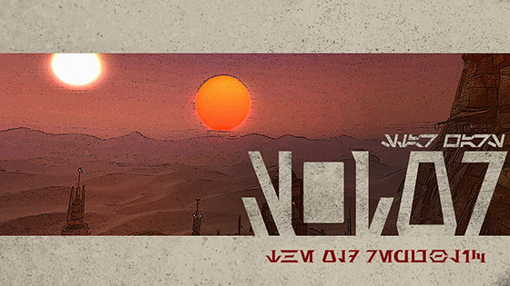
This week’s post is a quick one, and only indirectly related to SWTOR. The Disney+ series Andor launched today, and it has its own logo. Although the logo has been constantly changing over the course of the build up to its debut to the point that the version used in the title sequence is different from the one appearing in the show’s latest marketing materials, each logo has shared traits that I thought were interesting. In tribute, I decided I’d reinterpret it in Aurebesh with a bit of a SWTOR twist.
If I’m being honest, I’m not sure I quite pulled it off, but I did have fun in the attempt at least. The most distinctive trait of the Andor logo is the letter O formed in negative space between the D and R. Trying to pull of the same trick with an Aurebesh Wesk or W is pushing the readability of that illusion to its limit. To make it work, I had to trim off half of the lower arm of the letter Trill or T, but since the Andor logo removed the bar in the center of its A, I feel like this cheat is consistent with the original design.

The small Star Wars logo was inspired by/shamelessly ripped off from AurekFonts who has worked to archive and catalogue Star Wars’ long and varied history of alien typefaces across all its lore.
The red letters at the bottom are my own bespoke Aurebesh with serifs, which I’ve used here and there over the years. At best, I’d call it a “work in progress,” but at this point I’ve nearly completed the alphabet, so if I’ve got it, I’m gonna use it!
As for Andor itself, don’t worry, there are no spoilers here! If I choose to write about it, it won’t be until well after the season ends. For now, I’m hoping to enjoy it as it comes out this fall.


