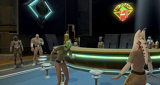
As we await the grand finale of Legacy of the Sith, I find myself in a bit of a lull with regards to Aurebesh. To combat this, I dipped into my to-do folder of screenshots of Aurebesh from Star Wars: The Old Republic. Despite the dozens of translations I’ve done over the years, there are many, many more signs, posters and displays that I’ve not yet covered in this project.

Click the thumbnails to see all the alien writing in English.
Long time readers should not be surprised to learn that when selecting subjects for this blog, I tend to favor things that I can connect to Star Wars lore, images that are inspired by art or design from the real world or from other fictional settings, or even just topics that allow me to go off on tangents and flights of fancy.
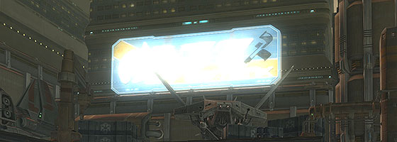
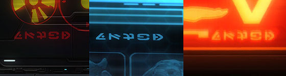
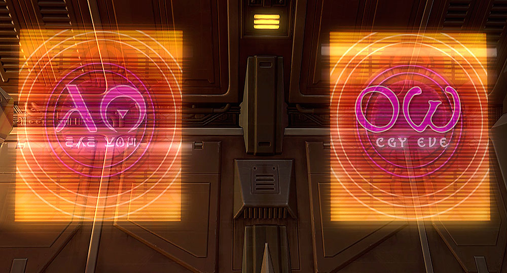
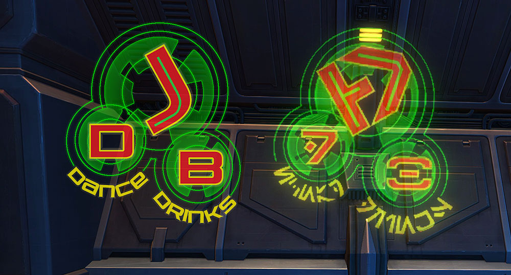
However much of the alien text seen in SWTOR, is intentionally designed to appear to be functional and practical. And that is most true when it comes to the huge variety of signage seen on Corellia from the war-torn streets of Coronet City to the toxic flooded corners of the Black Hole.
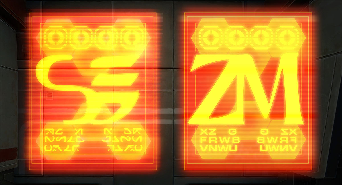
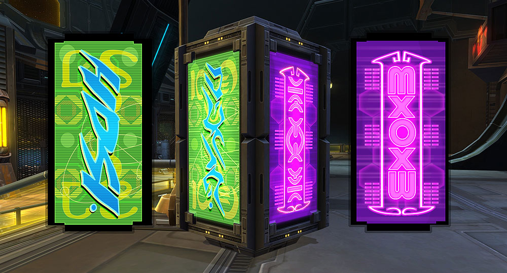
The common trait the three signs I’ve translated for this post share is simply a vertical orientation. There is no mystery or secret lore connected to their meaning. All three seem to be advertisements similar to what anyone who lives in a big city might see adorning the bus stops or street signs in the real world.

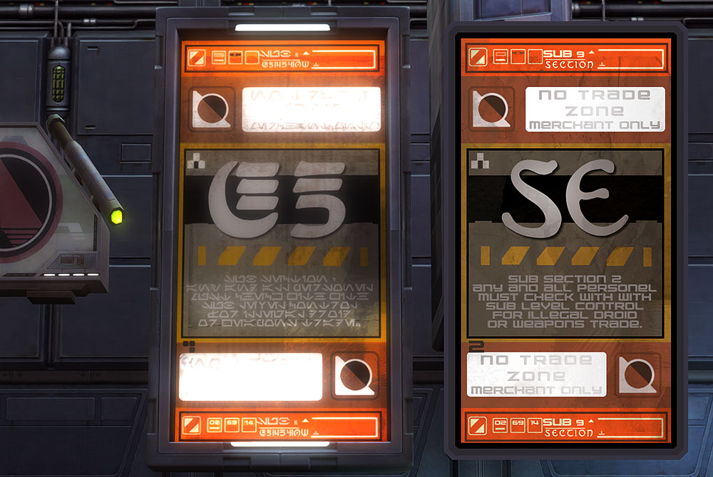
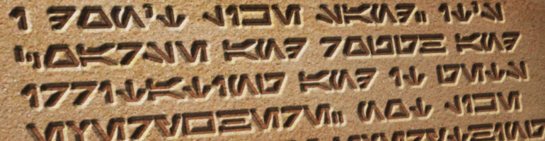
There isn’t much to say about this first sign. It features the letter “S” in New Futhork script. This script was created by Iain McCaig for The Phantom Menace as one of the writing systems seen on Naboo and is associated with luxury. For example, it can be found on the resort world of Makeb. However, in SWTOR it is also seen on the livery of spaceships and shuttles around the galaxy. Given Corellia’s association with shipbuilding, I think it’s fair to assume that the sign might refer to a starship manufacturer or dealership.

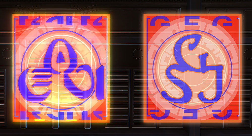
The next sign also fits in a rounded frame and gives me a bit more to translate. This is one of several examples in SWTOR of signs for shopping destinations advertised with a single letter as its logo. It would be reckless of me to even guess what the initial stands for. What I can say is that for my translation, instead of using the font I normally use for my Aurebesh translations, I created a custom “N” that more closely evokes the Aurebesh “nern” seen in the original sign.

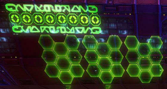
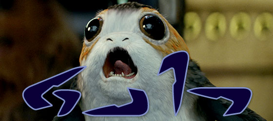
The last sign has seen better days. Corellia’s war, the pollution and quite possibly bored teenagers with sporting blasters have clearly taken their toll on this banged up and chipped advertisement. Given that Corellia is said to have three moons, it’s possible the Day Moon refers to one of those. Or it simply could be a poetic name for any manner of business.
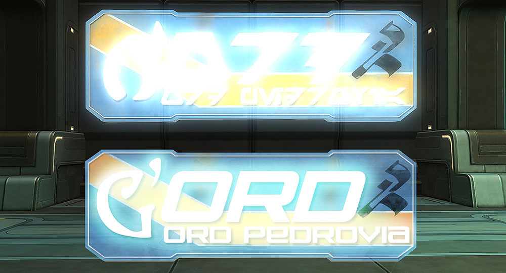
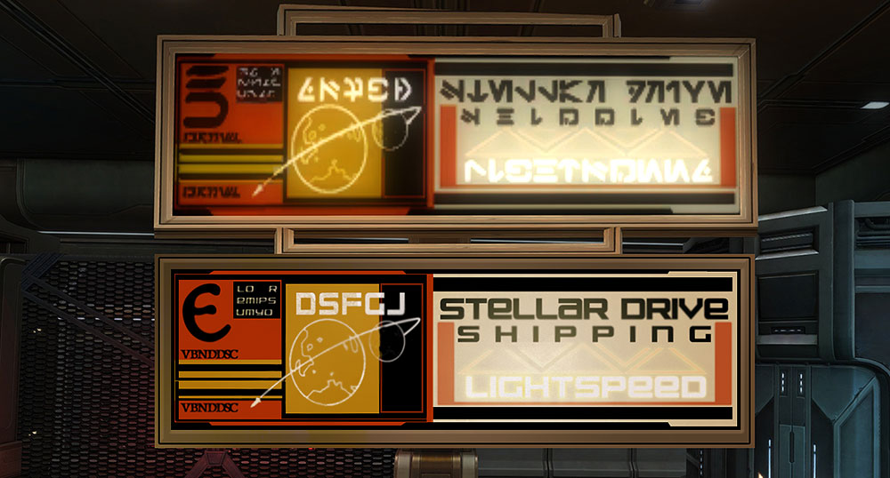
I’m certain much of the signage created for SWTOR was intentionally designed to be non-specific, primarily to allow the assets to be used in other locations in the game, but also to make these images feel more real. When I walk around my town and see signs for local restaurants, department stores or beauty salons, they’re simply part of the local color, they’re not deep cuts into historical lore. By creating unique names and logos for each of these ads in SWTOR, the artists who made them have added some extra dashes to the unique flavor of a galaxy far, far away.