Category Archives: Aurebesh to English

Shut Up and Stellar Drive

I’ve been wanting to recreate this sign since I started this blog. For all its interesting elements, however, there are also parts of it that frustrated me, and I’m not sure I completely cracked this nut.


The sign itself can be seen all over Corellia, but many players’ first encounter with it may be at the start of the Cademimu flashpoint. The sign includes at least two different languages, the non-standard Aurebesh font Galactic Standard and a touch of Futhork.

The resolution of this sign is low, and the writing is blurry and indistinct no matter how close you get to it. On the left, the white text on the black background is so distorted that I can make neither head nor tails out of it. The word that appears twice beneath the Futhork ‘E’ is also difficult to decipher. I think it might be written using the Sith Prophesy font, and have done my best to translate it that way, but I would not be surprised in the least if I got that wrong.

If any sharp-eyed reader has better suggestions, I hope you’ll share your insight with me!

One interesting element of this sign is the array of five letters over the graphic of the planet and moon. This exact arrangement appears in very many other signs throughout the game, even ones that otherwise use proper Aurebesh. Whether it is simply a piece of commonly used clip art or an inside joke of some kind, I cannot say.

Even though aspects of this graphic remain obscure to me, it is still one of my favorite signs in the game. The use of space letters give it an alien touch, but the design keeps it grounded and recognizable as something that fits naturally in the Star Wars setting.


Comments Off on Shut Up and Stellar Drive

Filed under Aurebesh to English, Futhork to English

When You Come to a Futhork in the Road, Take It

Vacation is over so let’s dive back in! This week we pay a visit to the war torn planet of Corellia, whose cosmopolitan history makes it a welcome home to many alien languages. Indeed, some of the signs found on Corellia can be found no where else in the game. This time, let’s examine two displays that prominently feature the language Futhork from the planet Naboo.

The large sign featured here includes a somewhat rare example in SWTOR of Futhork that can actually be translated into readable English. Therefore it quite literally speaks for itself. I also translated the smaller neon sign, which includes some bonus Aurebesh and Futhork. The two Futhork letters are oriented in different directions, although it’s hard to tell in my recreation; in addition the “I” glyph is modified with an extra arm stroke at the base of the letter.

Like many others in the game, this warm, glowing sign features arrays of seemingly random letters. This one is hanging upside down, but my translation has set it right side up. The center group of glyphs is again Futhork, but the shapes at the top and bottom seem to be cropped letters written using the Trade Federation script. This font, created for The Phantom Menace, can be found in many signs around the game, but when used, the glyphs are very often distorted or smashed together. The Trade Federation letters here are not only cropped at their midline, but by flipping the sign to make the Futhork orient properly, the partial letters have become flipped. This translator can’t win either way.

As I mentioned, Corellia is home to a vast trove of signage in Aurebesh and other languages, and in the weeks ahead, there will be plenty more material to explore.


Comments Off on When You Come to a Futhork in the Road, Take It

Filed under Aurebesh to English, Futhork to English

Turning Day Into Night Time

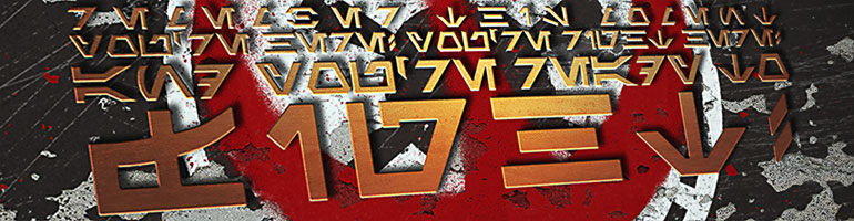
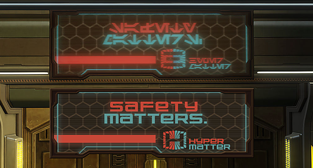
This week, let’s continue to examine some of Nar Shaddaa’s neon signs, focusing on two that Sith faction players will see as they enter the infamous Star Cluster Casino.

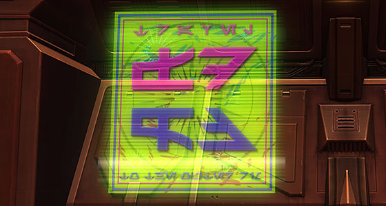
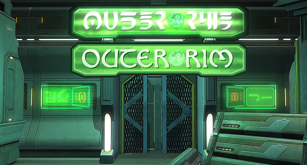
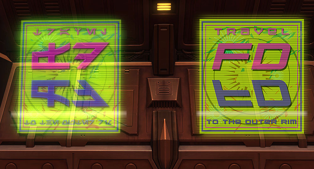
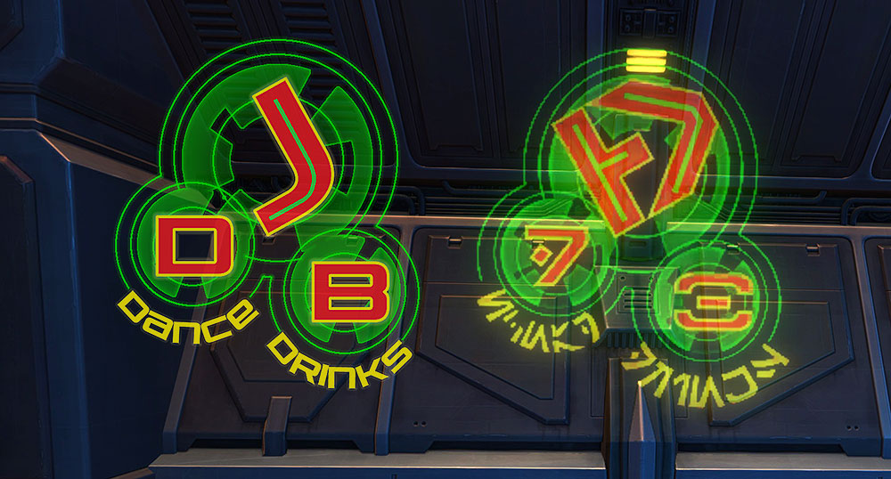
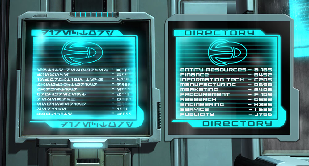
First up, we have something that at first seems to be another standard, simple advertisement exhorting viewers to travel to the Outer Rim, but there is quite a bit going on here, with several layers of graphical elements including rectangular and circular frames, two different starburst graphics as well as two different colored scattered accent shapes. Recreating this in English was a bit more challenging than I expected it would be!

This sign, which can be seen prominently on the Nar Shaddaa loading screen, is, of course, not written in Aurebesh, but looks to have been created using Erik Schroeder’s font Sith Prophesy which models the language officially known as Common Sith. This language mainly appears in Star Wars as the writing seen on Darth Vader’s chest control panels.

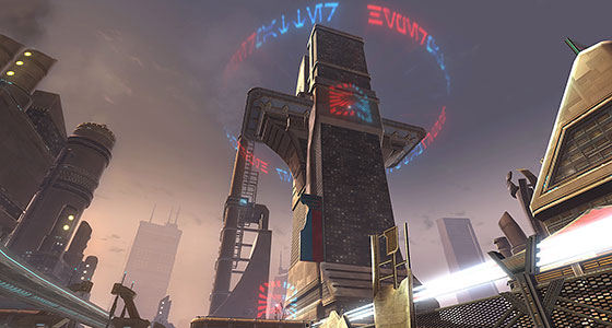
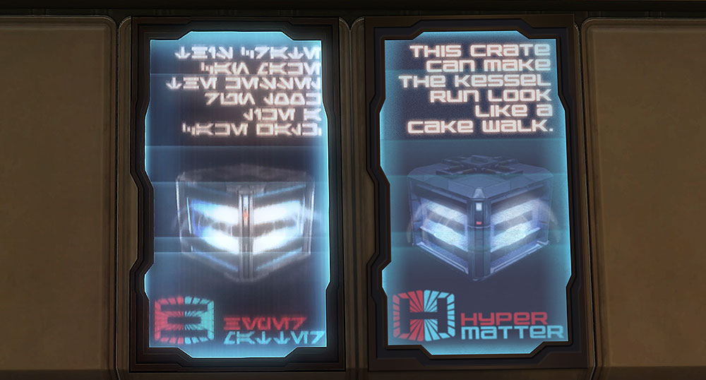
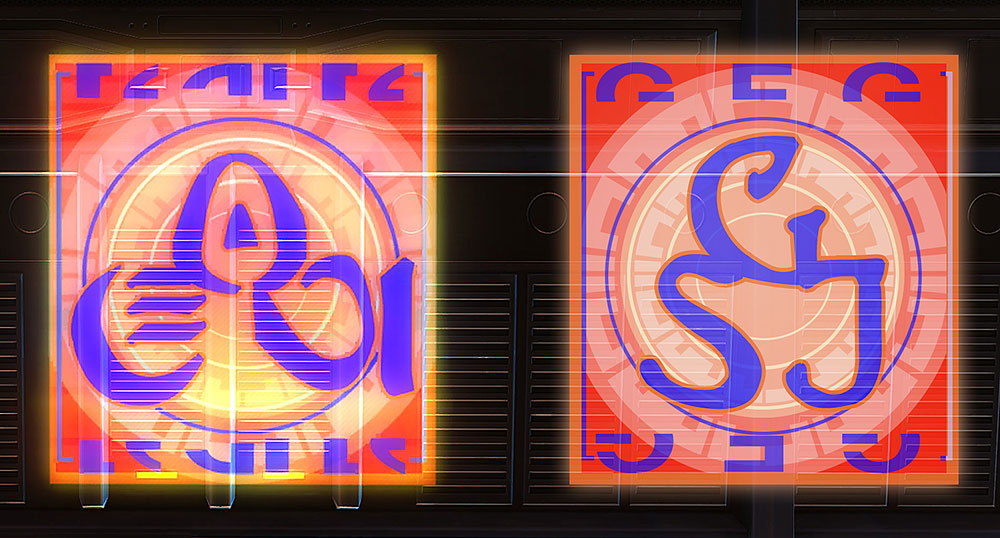
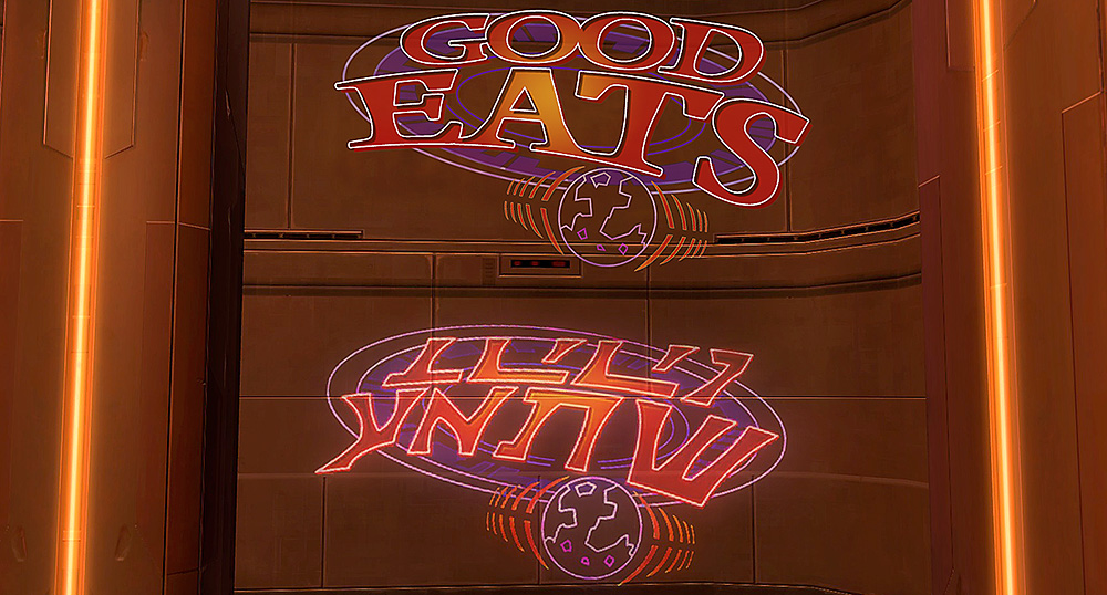
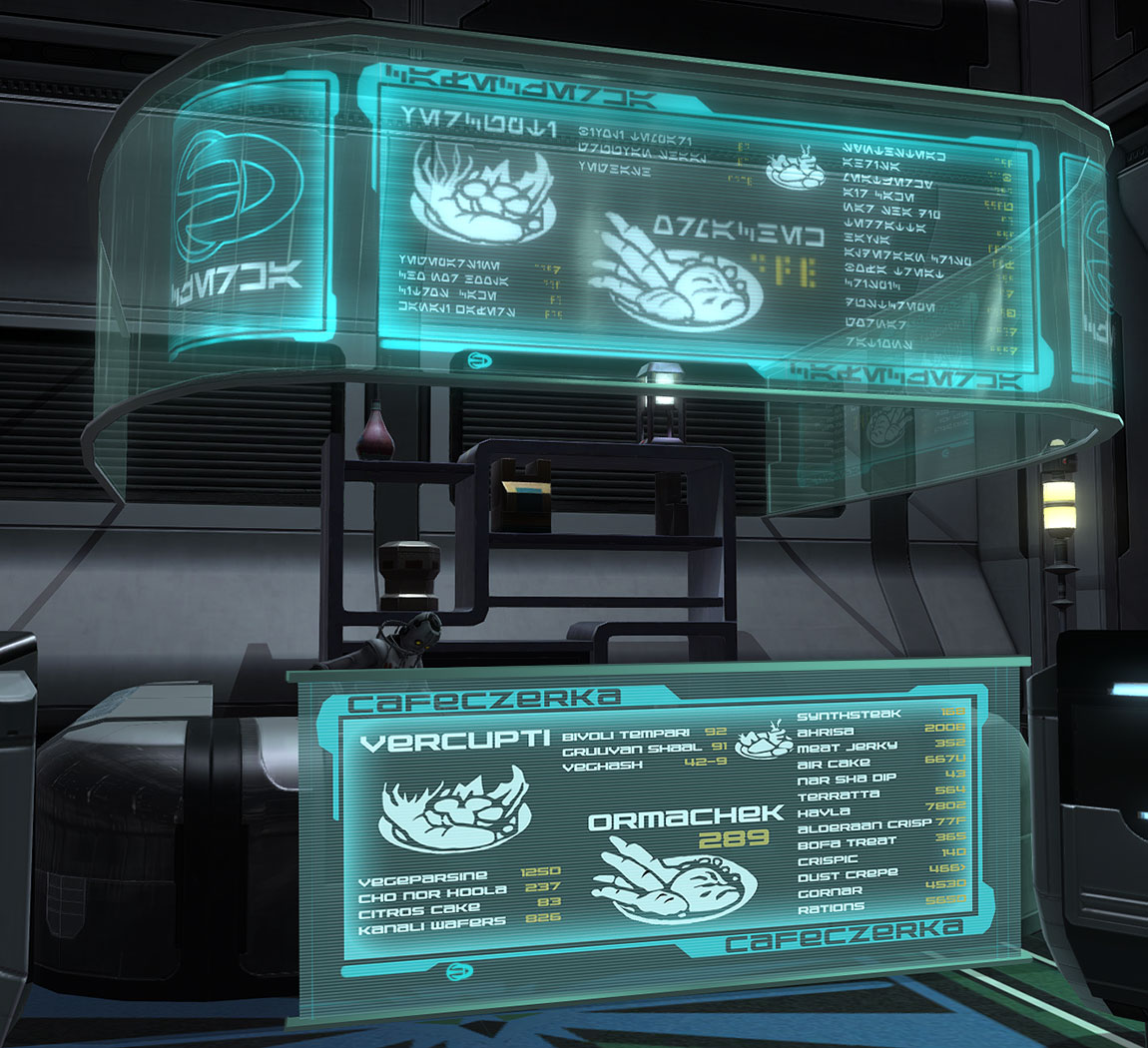
Given that pureblood Sith are common in SWTOR’s setting it’s not surprising that they’d have restaurants and advertising aimed specifically at them, although I confess I wonder what constitutes fine dining to a Sith.

This sign’s translation is a fairly common diner name, but I imagine it might also be a reference to Alton Brown’s beloved television show.

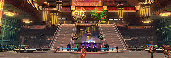
Manaan Stronghold Review

Patch 5.3 brought a bunch of stuff including the controversial change to tunings (I’m fine with it, especially once unlocked crystals and tunings become mail-able in legacy weapons) and the second encounter in the Gods from the Machine operation (crazy, fun fight!), but the one I’ve spent the most time with is the new Manaan stronghold. I thought I’d share a few impressions as I work my way towards 100% completion.

First off, it’s beautiful and I’ve absolutely enjoyed my time decorating. My complaints are mostly the familiar decorators’ laments about hook placement and type. Why aren’t the rug hooks where I want them? Why won’t that deco go up against the wall? Why won’t that deco fit on that hook?

Manaan does have a few specific issues. I’ve heard some folks complain that it’s too small, but after the massive sprawl of Yavin, I’m okay with a smaller stronghold. However, its size is actually deceptive. The stronghold’s main staging area is actually huge, but it kind of feels small. Yavin’s Temple Grounds area is much larger to be sure, but that section is subdivided into distinct areas (the temple roof, the bridge, the paved platform, the various clearings, the cave, the swimming hole out back, etc.), Manaan’s main area, on the other hand, is just one connected and visually identical area. I think this section could’ve been better subdivided using elements from the existing Manaan zone such as the tunnel that splits the two open areas and the side office in which we met Theron and Lana during Forged Alliances.

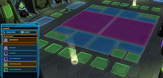
I welcome the generous inclusion of numerous centerpiece hooks (especially the ones on the ocean floor), but it’s frustrating that the alternative layouts for centerpieces are not great. Two out of the four options waste fully half of the hook space, and the other two can be awkward to use. This is especially the case in the two side rooms on the Underwater Observatory level. If you don’t want to place a centerpiece, getting those rooms just right can be a tricky. Personally I’d like to see an alternative layout (seen below) with both horizontal and vertical orientations for the Centerpiece hook that consists of two large hooks, flanked on either side by a mix of medium, medium narrow and small hooks.

The small wall hooks in the ceilings of those two rooms are a strange choice. I get that many large ceiling decorations might clip in those spots, but many other fixtures such as hanging lights and chandeliers would fit wonderfully. I know that Manaan’s architectural style doesn’t lend itself to large, flat spaces, but it should be up to the decorators if we care about the clipping.

Otherwise, I’m not a fan of the invisible wall outside the rooftop garden. I imagine that the entire complex is probably not fully rendered, but I do wish I could explore more. And even if I can’t decorate the interior spaces below the garden, I’d still like to place decorations on the roof down there.

My last Manaan specific nitpick concerns the elevators in the stronghold. When you exit them, your character is facing the elevator, forcing you to turn around whenever you enter a new level. You really should be facing the room as you step off the lift.

Finally, I thought I’d conclude with some general Stronghold and decoration changes I’d like to see. I like the hook system, I really do. Working within limits prevents me from going too far down the decorating rabbit hole and has sparked some creative solutions, but it could use some tweaking.

My main frustration is this: which decorations fit on which hooks has never been consistent. A café table will fit on a medium hook, but the similar-sized Dejarik table will not. Why? If a decoration can even remotely fit on a hook, we should be able to place it on that hook. I’d like to see the hooks for every decoration given another pass. There are many large decos that would fit just fine medium hooks, and it sometimes feels like the designers have forgotten the medium narrow hook even exists.

The introductory cut scene currently plays whenever you zone into Manaan, and I’ve seen this described as a feature not a bug. While I don’t want to have to spacebar through the scene every time I go to my stronghold, I will say it is sometimes cool to see that scene play once there are decorations in place. It’d be nice to have an on demand option to take the tour of a stronghold after each characters’ first visit. Could an option to watch the scene be added to the control panel that exists in every stronghold?

I was pleasantly surprised by how much I enjoy decorating strongholds, and Manaan has not been an exception. It is easily the most scenic stronghold and while, unlike Coruscant, it doesn’t feel like a place I’d live, it sure is a beautiful place to visit. I look forward to basking in the sun and putting the last decoration in place in the not too distant future.


Comments Off on Turning Day Into Night Time

Filed under Aurebesh to English, General SWTOR

Bright Light City Gonna Set My Soul On Fire

This week, inspired by the return of the Nar Shaddaa Nightlife event, I thought I’d take a look at a pair of the many neon signs that light up the night on the Smuggler’s Moon, focusing on two that are prominently displayed in the Club Vertica Casino.

This sign is written using Naboo’s Futhork font, and variations of it can be seen throughout Nar Shaddaa. In the example above, the sign is flipped and the letters are reversed, but the sign often appears with the letters properly oriented, as can be seen in the image at the top of this post. For my “translation” I’ve oriented the letters to be readable. Not that there is much to read, since the sign is as obscure in English as it is in Futhork. As I’ve said before, this doesn’t bother me, since the alien glyphs are most important as design elements. Besides the sign might make perfect sense to any native speaker of Huttese, Bocce or Mando’a.

A closer look at the graphic reveals that it is made up of several layers of different elements aside from the Futhork letters. The circle and bracket decoration can be seen in many other neon signs. In addition, a semi-scalloped circular pattern appears twice around the letters. This is a common pattern in Huttese decor. Next time you visit Karagga’s or Nem’ro’s palace, look for it on the floor of the larger halls.

This sign is also a common sight throughout the game, and is written using the non-standard Aurebesh font, Galactic Basic. Unlike the previous neon advertisement, this one can be translated; however one of the words in yellow at the base of the sign reads right to left. I would guess when it was typed on a path, the designer forgot to orient the letters “properly.” Again, for my recreation, I opted to make the sign readable in English. As for what the large initials mean, I can only guess. In fact, I’m happy to do so: how about “Jabba’s Dance Barge” or maybe “Jilasi’s Draft Boutique” or perhaps even “DJ Bareesh”? I bet that Hutt can lay down some serious beats!

Nightlife Event Review

Finally, I thought I’d offer some quick thoughts on the return of the Nightlife Event. I won’t lie; it was never my favorite. Clicking on slot machines is about as far from engaging game play as you can get. That said, I can’t deny that the event offers very neat rewards including some of the best legacy weapons in the game, and the new, interactive decorations. Fortunately, the items that interest me the most can be purchased from the vendors using Golden Certificates which are common prizes from the Kingpin’s Slot Machine. In addition, now that slots tokens drop from Flashpoint and Operation bosses, folks can participate and collect rewards without breaking the bank. This is a very nice, player friendly addition to the event.

If I really wanted the Gamorrean Companion or the Rancor Mount, I might despise the event for the monotonous click-fest and money-sink that it is. However, that I can take a pocket full of tokens awarded from a week’s worth of casual play and turn them into a dance floor for my stronghold or a Tommy Gun for my Trooper is something I won’t complain about.

I’ve said it before but, I remain hopeful that we’ll eventually see a brand, new event or at least a fresh coat of paint applied to the old events to keep them interesting for veteran players. Fingers crossed!

Comments Off on Bright Light City Gonna Set My Soul On Fire

Filed under Aurebesh to English, Futhork to English, General SWTOR

Czerka: Titans of Industry, part 2

This week we return to CZ-198 to look at some more of the unique displays created for Czerka’s secret moonbase, focusing on signs found in the the flashpoint Czerka Core Meltdown.

At the entrance of the area, visitors are greeted with a helpful map, which indicates their position and annotates the major sections of the research facility that makes up the flashpoint.

Aside from the areas of note, this sign is of interest because it demonstrates one of several ways the Aurebesh handles upper and lower case letters. Formal Aurebesh makes no allowance for case, but several of the official and unofficial Aurebesh fonts handle capital letters in different ways. If you’re playing at the time this is posted, you may have noticed an image in SWTOR’s launcher promoting the Nar Shaddaa Nightlife event that contains Aurebesh letters that seem to be mirrored. That’s because the image was created with a font that uses reversed Aurebesh glyphs when generating upper case letters. The font used in this CZ sign, however, simply renders capitals as larger than lower case letters. Neither version is correct. It’s just a matter of the various font creators finding different solutions to fill the gaps in the Aurebesh font family.

Venturing deeper into the flashpoint, visitors will come across two signs outside the facilities Biomes that contain two of the flashpoint’s boss encounters. One biome recreates the environment of the desert world Tatooine, and the other replicates the swampy interior of Dromund Kaas.

Each sign includes information on the planets in question. The resolution of the letters is not very high, making the text somewhat challenging to read. Moreover the text on the Tatooine sign is fragmentary. However, the content of these signs was derived from swtor.com’s holonet entries on Tatooine and Dromund Kaas, and you can read the complete entries on each planet there.

The text in both planetary signs seems to have been pasted into the text box with the hyphenation option active, so some words are broken up across lines. I have maintained the original hyphenation in my translation.

Finally, all three of these signs are available as stronghold decorations from the CZ-198 reputation vendor in the Sith and Republic staging areas outside the flashpoint portals. Check ‘em out!

Update: While collecting screenshots for this entry, I came across a poster, which I had previously examined in this blog. However, the example I translated was cropped, and it seems there was additional Aurebesh text on the poster that I missed. Therefore, I have revised and expanded my entry on that poster.


Comments Off on Czerka: Titans of Industry, part 2

Filed under Aurebesh to English

Czerka: Titans of Industry, part 1

During SWTOR’s Rise of the Hutt Cartel expansion, patch 2.3 brought players to the secret moon base CZ-198, one of many clandestine research facilities owned by the Czerka Corporation. In addition to being home to a daily quest hub and two flashpoints, CZ-198 is adorned with numerous examples of Aurebesh signage and decorations.

Czerka has it’s origins in the earliest days of the expanded universe, with the company and its logo created as a weapons manufacturer. Czerka played a significant role in both Knights of the Old Republic and in SWTOR where their operatives are the major antagonists of the Tatooine story-arc.

Many of the graphics, especially the ones with specific context, such as signs for the “Tram Station”, “Freight Depot” and “Waste Disposal” are unique to the moon, although a few of the displays can be seen elsewhere in the galaxy, including on the bridge of the Gravestone. Several of the unique signs contain information about Czerka’s research base. The display shown above directs visitors to the various offices found on CZ-198. One department has been appropriately renamed for the setting, and it’s amusing to note that the publicity department seems to have been consigned to the basement beneath even the moon’s facility operations.

Czerka also made sure to provide its employees with the finest nutritional offerings at the Cafeczerka which has options for any tastes and any budget. I’ve got to tip my hat to the artists at Bioware for doing their research on this one. The dishes on the menu are derived from sources across the Star Wars canon. A few do seem to be unique creations of the Czerka Culinary Division, including the spicy Nar Sha Dip and the too often overcooked Alderaan Crisp. Evil geniuses never understand that char is not a flavor!

While this vendor stall can be visited in the Czerka flashpoints, it is also available as a stronghold decoration for folks who like to keep their characters well fed.

There is too much signage on display on CZ-198 for me to cover in a single post, so I will be returning to this moon in the near future.


Comments Off on Czerka: Titans of Industry, part 1

Filed under Aurebesh to English

Fly the Unfriendly Skies

This week, we pay a visit to fragrant, scenic Nal Hutta, adopted home of the Hutts and the starport at Jiguuna. A prominent sign outside the terminal announces arrivals and departures and their current status.

The listings are of transport services, many of which have their origins in Star Wars lore. Camura Lines was first mentioned back in West End Games’ Star Wars The Roleplaying Game. Yarella is a common Hutt name and thus appropriate for the sign’s context. Rim Shipping is generic enough, but could also be a precursor to “Core to Rim Shipping”, which also appeared in WEG’s SWRPG. Finally Gronco seems to be a Star Wars-ification of the word “bronco” or simply just a funny name that could very well apply to many a Hutt, Wookiee, Gamorrean or a hot shot pilot.

Only half of the scheduled flights are on time, and nearly a third are cancelled, so getting to and from Hutta is a coin flip at best. And you better hope the Hutt Cartel hasn’t overbooked your flight. Being put into Carbon Freeze and dumped in with the luggage is standard procedure for folks who won’t give up their seats. But at least you get there. Thawing and dealing with the consequences of hibernation sickness, however, are your own responsibilities.

This is one of many signs in SWTOR that uses the non-standard Aurebesh font Galactic Basic. The small, red glyphs that bracket the large sign seem to feature a stylized Senth letter, so I have re-created it as “s” in my version. Given that the sign is for a star or shuttle port, it seems like a safe pick.


Comments Off on Fly the Unfriendly Skies

Filed under Aurebesh to English

Futhork meets Aurebesh

After an unexpected break, we’re back! This week, let’s look at this huge poster which hangs over the outdoor docks in Coruscant’s Old Galactic Marketplace. Unlike most other posters you might see in this area, it is not an advertisement. Instead it is a notice of trade restrictions that are probably no longer enforced now that the Migrant Merchants Guide is running the zone.

The most notable feature of this poster is the use of the Futhork font in its prominent center section and in the small text at the top and bottom. Conceptual designer Iain McCaig created Futhork as one of Naboo’s writing styles for The Phantom Menace. and it is featured throughout the prequel trilogy. In SWTOR, Futhork and many other languages can be seen most commonly on Nar Shaddaa in the neon and holographic signs that dominate the skyline of the infamous Smuggler’s Moon.

Futhork is described as an elegant hand-written font and I imagine it is used in the same way as Blackletter or Gothic script to make a design seem more elegant or official.

The poster itself has a nice warm feel that I quite like. The Futhork flourishes make it stand out from other signage in the game. The accidentally repeated word in the third line of the block of text in the center section again exposes the danger of writing in an alien language, but I don’t think it detracts from the overall design. Another nice touch is in the orange tabs at the top and the bottom. Although the layout is the same in both sections, each of the small boxes has its own element.

Finally, the text in the two white sections is blown out and difficult to read. If you look at the poster from an angle or play with the levels in Photoshop, however, the text becomes visible. In my translation, I kept the words readable.

Patch 5.2: The War for Iokath

Since I last posted, patch 5.2 was published and I thought I’d share some quick impressions. Overall, I’m pleased. The story itself is mainly seems to be prologue to the next big arc and thus has a lot to set up: the return to Iokath, the return of two of the game’s signature companions, the renewed conflict between the Republic and Sith, the return of Zakuul’s old gods and the emergence of a traitor in the ranks. That’s a whole lot ground to cover and not everything gets the space it needs, but I’m curious to see where things go from here.

Without getting into spoiler territory, one thing that did impress me was the use of Quinn. It’s an understatement to call him one of the game’s most infamous companions. My consular sided with the Republic, and while Elara remained mostly a background character, I was pleased that the story did a good job making Quinn into a quality antagonist who I wouldn’t mind seeing as a recurring villain. Given how story choices work, I’m not sure he’ll ever pop up again, but I never thought I’d want to see more of Quinn!

The operation’s first boss Tyth is a fun fight, requiring appropriate coordination on Veteran Mode, but remaining welcoming to new and inexperienced players on Story Mode. I look forward to facing the twins Esne and Aivela next.

I haven’t spent too much time in the daily area. I received so many reputation tokens just from the story that I haven’t felt the need to dive too deep into the dailies and have only completed the weekly once. The zone is sprawling and still confusing to me. This is a good thing; I don’t mind knowing that I will need to explore the area and get comfortable with its layout. That said, the map’s tooltips pointing to quest objectives need some work. The environment itself is very cool, and I’m happy to just stop and admire the scenery.

However, some of the quests are buggy. I’ve killed the Colossal Droid twice but have yet to receive credit, and surely the Mouse droid daily isn’t meant to be so frustrating and difficult as it is now.

I know having to spend power shards to access the quests to control the various droids and vehicles on Iokath has been controversial, but I can see what Bioware is going for with this system. The problem with daily areas is that they get old fast, and adding a mechanic where certain quests can only be unlocked with extra effort strikes me as a neat idea. The notion that taking control of a walker is something I have to save up for makes it a bit of a special event. The rub is in making these quests as fun and rewarding as possible, and I’m not sure they’re there yet. I won’t lie, getting killed by random mobs while wandering around as a mouse droid is not awesome, especially since I have to burn more shards just to try again.

My stash of shards is pretty thin right now, but if the Iokath currency becomes like all the other event and area currencies in the game, I’ll eventually have shards coming out of my ears, so having a use for them after I have all the reputation rewards I want doesn’t strike me as a bad idea.

Hopefully the bugs will get squashed in short order, and I’m curious to see what comes next.

Lastly, SWTOR’s new Game Producer Keith Kanneg and Creative Director Charles Boyd have both made some appearances on the forums recently and their posts have included actual information and teased upcoming improvements. This has been a most welcome change of pace and I’m hopeful this continued engagement with the community will continue.


Comments Off on Futhork meets Aurebesh

Filed under Aurebesh to English, Futhork to English, KotET

Shop Together. Happy Together.

This week, let’s examine a pair of posters that regular visitors to the Republic’s Carrick Station or any player of Huttball will surely recognize.

The orange banner is another travel poster, this time for an interstellar transport firm called DGB. The meaning of the initials and the numbers along side them are unknown to me. The second poster with its delightfully Eighties contrasting blue and pink color scheme advertises a galactic marketplace.

I can only speculate on the meaning of the large letter Besh: Balmorra? Bespin? Buy n Large? The Mern or M letter, however, is a common element on some other marketplace posters. I’ve speculated on its specific meaning before, and see no reason to stop now. The double Ms could very well stand for the Migrant Merchants Guild, which seized control of Coruscant’s Old Galactic Marketplace.

Both posters use design elements seen elsewhere in the game. The triangular “triforce” symbol and the connected hexagons are often seen on their own in any neon-soaked location from the Huttball arena to Nar Shaddaa’s Promendade.

It seems that even in a galaxy far, far away corporate branding is as inescapable, as it is in our own.


Comments Off on Shop Together. Happy Together.

Filed under Aurebesh to English

Just Breathe

My pledge to take the week off has faltered yet again with the release of the trailer for The Last Jedi and its inclusion of Aurebesh on Finn’s medical pod.

Much of the text is so blurry and distorted that it is difficult if not impossible to decipher. Moreover, what is readable, specifically the sets of four characters that shift during the second or two this shot is on screen seem to be random characters. This information can easily be chalked up as medical jargon and acronyms obscure to all but the most seasoned of medical droids.

The information at the top of the red block, however, does seem to be translateable, and might constitute a very minor spoiler, so Caveat Clicktor!

As is often the case with Aurebesh ligatures, they are not used as letters but rather the English keyboard symbol that the font uses to generate them, so I translated the Cherek and Shen glyphs as brackets.

There seems to be more Aurebesh in white on the right side of the pod, but it is far too blurry for me to take a stab at.

To make sense of the Aurebesh in the screen shot, I did have to apply some technical jiggery-pokery in Photoshop. Even so this translation involves more guessing and perhaps wishful thinking than usual. Other translators may very well come to different conclusions.


Comments Off on Just Breathe

Filed under Aurebesh to English, General Star Wars